Tutorial: From Interactive Data Exploration to Deployment
Introduction
In this tutorial you will create a realtime operational stock trading dashboard with alerting capabilities by following a typical data science project in four parts:
| Part 1: Static data Exploration | Part 2: Realtime dashboard | Part 3: Kafka data source | Part 4: Production | |
|---|---|---|---|---|
| Interactive development in Jupyter with Pathway | ✅ | |||
| Experiments with static data samples | ✅ | |||
| Streaming data simulation | ✅ | |||
| Live visualization in Jupyter | ✅ | |||
| Alerting functionality / sending data to outputs | ✅ | |||
| Connecting Kafka data sources | ✅ | |||
| Deployment of dockerized container | ✅ | |||
| Embedding Jupyter live dashboards in the web | ✅ |
This tutorial demonstrates the key design choice we made while building Pathway: the same code works with both bounded and unbounded datasets, which we shortly call batch and streaming parity. In Part 1, this parity allows you to consider only a simple scenario in which you work with static dataset. Then, you can use the same code in Part 2 to run computation processing a data stream, without even bothering yourself with thinking about updates, triggers, operator states, and all the things that come in the package with dynamic datasets. However, Pathway still allows you to extend the logic to benefit from temporal nature of data, which includes possibility of buffering early data, filtering late data, and cleaning memory by discarding old data. Part 3 shows you how to switch to a Kafka data sources and adds alerting, which is a final step towards final, deployable version of code. Finally, Part 4 takes the code from Part 3 and sets up all you need to deploy a production ready dashboard.
The following video highlights the dashboard, still running in notebook:

These four parts build on top of each other, but can be read independently.
For more explanation on Bollinger Bands, please check out the showcase.
Project description
Your market finance team wants to assess the probable evolution of some prices in a high frequency trading setup and you are to analyze immediate price movements. To this end, proper price monitoring is required and alerts should be raised when an asset is to be bought (low price) or sold (high price). Bollinger Bands are a well known method for performing such technical analysis and provide a widely used statistical chart for visualizing price action. The dashboard you will build is a decision-making tool based on this chart and a sequence of alerts to inform about buying or selling opportunities.
Tips for following the tutorial
Parts 1, 2 and 3 of this tutorial happen entirely inside Jupyter notebooks. You can execute them locally in a code environment with Pathway installed (please follow instructions in Getting Started to set up the environment). Alternatively, you can run them in the cloud, using Google Colab.
Part 4 transforms the project from notebooks into a deployable Python package. To execute it you need a Linux or Mac system with Docker installed.
Part 1: Static data exploration in Jupyter
You have obtained some historical data in CSV format. Now you will analyze it statically with Pathway inside a Jupyter notebook. The best part: the Pathway code developed during exploration on static data is ready to be used with streaming data (Part 2)!
The instruction below implement a data exploration notebook. You can follow them starting with an empty Jupyter or Colab notebook. Alternatively, you can go straight to and download the final Part 1 notebook or open it directly in your browser using Colab.
Installing dependencies
Make sure you have pathway installed. If working in Colab, you can install it into the runtime by creating a code cell with the command !pip install pathway.
Next, download the data by using a code cell with the command !wget -nc https://gist.githubusercontent.com/janchorowski/e351af72ecd8d206a34763a428826ab7/raw/ticker.csv.
If you plan to run the tutorial notebooks under VSCode, note that a specific version of jupyterlab is required due to a known compatibility issue with jupyter_bokeh. Please refer to this discussion for workarounds.
Loading data
You can now start data wrangling. The first thing to do is to load the data from the CSV file into a Pathway table, using pw.io.csv.read. In general, at the time you define the logic of our Pathway script, the data is not available yet. As such, the graph representing Pathway computation is typed, just to be sure it works properly on data streamed in the future. For this reason, the pw.io.csv.read function needs a schema which is a blueprint for the data structure.
However, for the sake of design, Pathway provides the schema_from_csv function that can generate schema out of csv file for you (using some static csv file) and schema definition is discussed later in this tutorial. Right now you can generate the schema and load the CSV file using the code below:
import datetime

import pathway as pw

fname = "ticker.csv"
schema = pw.schema_from_csv(fname)
data = pw.io.csv.read(fname, schema=schema, mode="static")
data
The last line (empty data statement) prints the contents obtained from the CSV file. To do this, Pathway temporarily builds and executes a dataflow that reads the data and captures it in a table. It can do so, because the file reader is told to read the file and exit by setting the mode="static" flag. Thus, when data is known in advance, Pathway allows previewing results on demand. The second part of this tutorial describes what happens if the data source is streaming future data.
After you run this cell you should get the following table:
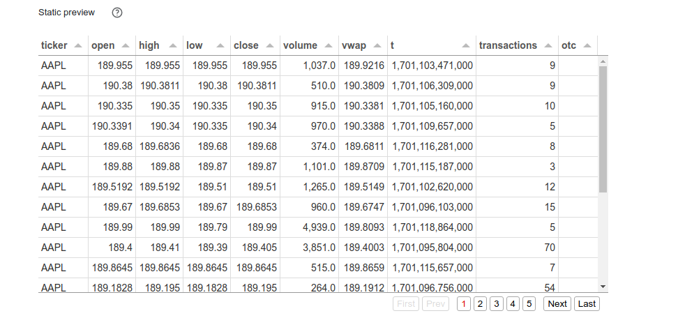
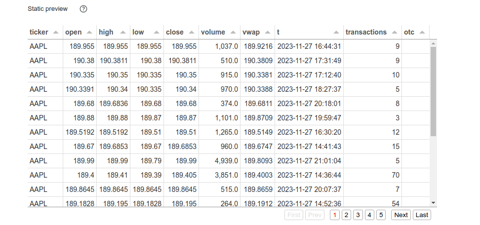
Inspecting the contents of the data table, you can notice that timestamps are integers that need to be parsed. We can use the utc_from_timestamp located in the dt namespace for it. It'll return a Universal (pw.DateTimeUtc) time.
The date parsing code is given below, along with the call to print the contents of the table. As you can see, the timestamps are now properly parsed and pretty-printed.
data = data.with_columns(t=data.t.dt.utc_from_timestamp(unit="ms"))
data
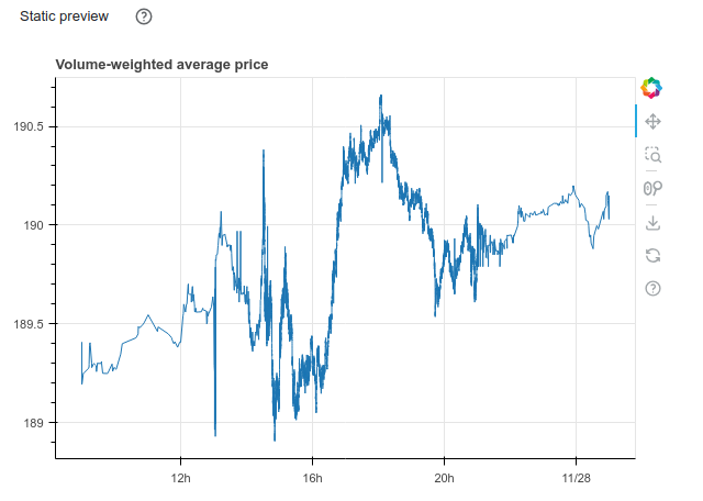
To make a plot from a Pathway table, an external visualization library is required. In perspective of streaming data, such a library should make it possible to update a chart as Pathway processes the data. The Bokeh library has be chosen for that in this tutorial. The plotting function only takes a Bokeh ColumnDataSource src argument which will be automatically populated by Pathway with the table contents. Here is a simple example to plot the history of the volume-weighted average price vwap available in the data table:
import bokeh.plotting

def vwap_history(src):
    fig = bokeh.plotting.figure(
        height=400, width=600,
        title="Volume-weighted average price",
        x_axis_type="datetime"
    )
    fig.line("t", "vwap", source=src)
    return fig
To use this function on the data table, simply call the method plot indicating that values should be sorted using the t column before plotting.
data.plot(vwap_history, sorting_col="t")
You should get the following plot:
Designing the algorithm
Once the data is properly loaded and verified, you can start designing our trading algorithm. The Bollinger Bands method is based on upper and lower bounds to trigger sell or buy alerts respectively. These bounds are centered around a moving average whose standard deviation gives the radius of the band up to a multiplicative factor. This particular example uses a 20 minutes period for the moving average and a radius of 2 times the standard deviation.
To compute these statistics, the data must be grouped according to a sliding 20 minutes window and then reduced to obtain the moving average vwap, standard deviation vwstd and Bollinger bounds bollinger_upper and bollinger_lower. Such grouping operation is straightforward with the Pathway windowby function followed by a reduce call as explained in the Windowby - Reduce user guide. Thereafter, the sliding windows move through the data in 1 minute steps hop, but this parameter can be adjusted.
minute_20_stats = (
    data
    .windowby(
        pw.this.t,
        window=pw.temporal.sliding(
            hop=datetime.timedelta(minutes=1),
            duration=datetime.timedelta(minutes=20)
        ),
        instance=pw.this.ticker
    )
    .reduce(
        ticker=pw.this._pw_instance,
        t=pw.this._pw_window_end,
        volume=pw.reducers.sum(pw.this.volume),
        transact_total=pw.reducers.sum(pw.this.volume * pw.this.vwap),
        transact_total2=pw.reducers.sum(pw.this.volume * pw.this.vwap**2)
    )
    .with_columns(
        vwap=pw.this.transact_total / pw.this.volume
    )
    .with_columns(
        vwstd=(pw.this.transact_total2 / pw.this.volume - pw.this.vwap**2)**0.5
    ).with_columns(
        bollinger_upper=pw.this.vwap + 2 * pw.this.vwstd,
        bollinger_lower=pw.this.vwap - 2 * pw.this.vwstd
    )
)
minute_20_stats
Pathway uses the instance parameter to specify independent instances of the analysis - in this case, different stock tickers. Obviously, you do not want to mix trades of different companies' stock. Note that the content of the _pw_instance column is given by this instance parameter of the windowby call whose results also provide the end point _pw_window_end of the window.
In order to raise alerts and help with the decision to sell or buy, instantaneous price evolution is also necessary. To this end, the sample code computes the average value over one minute tumbling windows, a special case of sliding windows, in a similar way.
minute_1_stats = (
    data
    .windowby(
        pw.this.t,
        window=pw.temporal.tumbling(datetime.timedelta(minutes=1)),
        instance=pw.this.ticker
    )
    .reduce(
        ticker=pw.this._pw_instance,
        t=pw.this._pw_window_end,
        volume=pw.reducers.sum(pw.this.volume),
        transact_total=pw.reducers.sum(pw.this.volume * pw.this.vwap)
    )
    .with_columns(
        vwap=pw.this.transact_total / pw.this.volume
    )
)
minute_1_stats
The two statistics tables can now be joined to automatically detect when an alert should be triggered if there is sufficient transaction volume and if the price falls outside the Bollinger bounds. With the help of Pathway if_else function, the is_alert column is instantly translated into a usable decision making tool to advice buy, hodl or sell.
joint_stats = (
    minute_1_stats.join(
        minute_20_stats, pw.left.t == pw.right.t, pw.left.ticker == pw.right.ticker
    )
    .select(
        *pw.left,
        bollinger_lower=pw.right.bollinger_lower,
        bollinger_upper=pw.right.bollinger_upper
    )
    .with_columns(
        is_alert=(
            (pw.this.volume > 10000)
            & (
                (pw.this.vwap > pw.this.bollinger_upper)
                | (pw.this.vwap < pw.this.bollinger_lower)
            )
        )
    )
    .with_columns(
        action=pw.if_else(
            pw.this.is_alert,
            pw.if_else(pw.this.vwap > pw.this.bollinger_upper, "sell", "buy"),
            "hodl"
        )
    )
)
joint_stats
Filtering on alerts can easily be transformed into a table with all relevant information to be integrated into the final dashboard.
alerts = (
  joint_stats
  .filter(pw.this.is_alert)
  .select(pw.this.ticker, pw.this.t, pw.this.vwap, pw.this.action)
)
alerts
Plotting Bollinger Bands
To get the Bollinger Bands chart, the plotting function to pass to the plot method is slightly longer but joint_stats table contains all the needed information. The moving average vwap is used to plot the instant price and bollinger_lower and bollinger_upper for the Bollinger band. The alerts triggered by our Pathway code are also plotted to get a visual decision-making tool. This produces a ready to use widget without additional effort.
import bokeh.models

def stats_plotter(src):
    actions=["buy", "sell", "hodl"]
    color_map = bokeh.models.CategoricalColorMapper(
        factors=actions,
        palette=("#00ff00", "#ff0000", "#00000000")
    )

    fig = bokeh.plotting.figure(
        height=400, width=600,
        title="20 minutes Bollinger bands with last 1 minute average",
        x_axis_type="datetime"
    )

    fig.line("t", "vwap", source=src)

    fig.line("t", "bollinger_lower", source=src, line_alpha=0.3)
    fig.line("t", "bollinger_upper", source=src, line_alpha=0.3)
    fig.varea(
        x="t",
        y1="bollinger_lower",
        y2="bollinger_upper",
        fill_alpha=0.3,
        fill_color="gray",
        source=src,
    )

    fig.scatter(
        "t", "vwap",
        size=10, marker="circle",
        color={"field": "action", "transform": color_map},
        source=src
    )

    return fig

joint_stats.plot(stats_plotter, sorting_col="t")
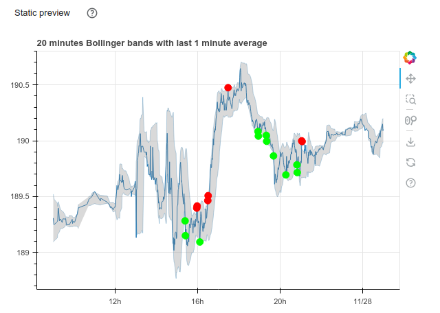
It looks like the Bollinger Band strategy is promising - it usually decides to buy at a lower value than it is selling. This concludes the data exploration part of the tutorial. You have successfully loaded a static data file into Pathway and used Pathway data transformation tools to detect interesting patterns in data and to make compelling visualizations.
This concludes Part 1. You can view the final notebook in Github or in Colab.
Please proceed to Part 2 to turn this static data exploration into a live dashboard.
Part 2: From static data exploration to interactive dashboard prototyping
You finished data exploration and now you are ready to prototype a live-updating dashboard inside Jupyter. To this end, you will replace the static data source by a streaming one and reuse the code from Part 1 to make a dashboard of interactively updating widgets.
We start with the notebook created in Part 1 - please copy it into a new file or download it.
Follow instructions below to prototype a dashboard, or preview directly the results of Part 2 as a notebook or in Colab.
Switching to streaming data
Pathway pw.demo.replay_csv function is the easiest way to go from a static data source provided by a CSV file to a streaming one based on the same data. This function uses the same schema as pw.io.csv.read and has an additional input_rate parameter to indicate the number of rows to read from the CSV file per second. Thus, just replace the pw.io.csv.read call with a pw.demo.replay_csv statement to start using a streaming data source.
# data = pw.io.csv.read(fname, schema=schema, mode="static")
data = pw.demo.replay_csv(fname, schema=schema, input_rate=1000)

# data
Please note that the replay uses the same schema as initially deduced from the input. You therefore need to perform the date parsing again:
data = data.with_columns(t=data.t.dt.utc_from_timestamp(unit="ms"))
Since your task here is to create a dashboard, you no longer need to display intermediate tables. Therefore, you can remove the empty data statement at the end of the data loading cell. Similarly, you can comment out or remove the data printing statements at the end of every other cells.
As promised, you can use the code designed for static data with streaming data.
Running the dashboard
You are now ready to prototype a dashboard. You can use the Panel library for this and simply move the Bollinger Bands chart widget and the alerts table in a row to obtain the announced result. The table show method offers some nice features like hiding the Pathway id column and sorting by timestamp to get the latest alerts first.
import panel as pn

pn.Row(
    joint_stats.plot(stats_plotter, sorting_col='t'),
    alerts.show(include_id=False, sorters=[{"field": "t", "dir": "desc"}])
)
Note that both widgets now advertise us that they are in Streaming mode instead of displaying a Static preview as in Part 1.
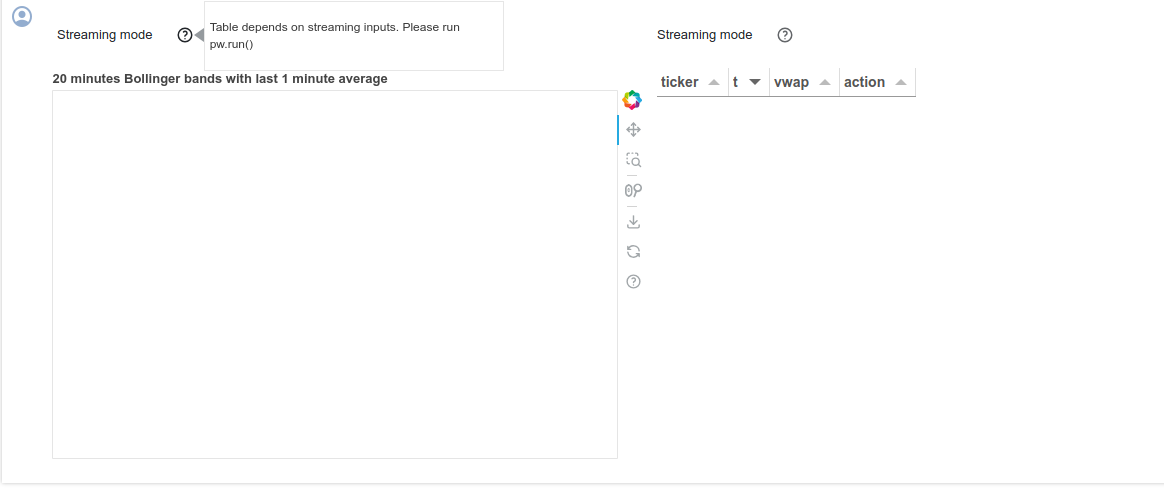
The final step to get a live-updating dashboard is to start streaming the data with pw.run(). There you go!
pw.run()
This ends the dashboard prototyping part of the tutorial, at this moment your code should generate plot as shown below:
There are several remarks with respect to the current behavior of the code. First, the datapoint come out of order, and as such, Pathway updates the old results. One of the effects of such behavior is the fact that you can see some temporary alerts that disappear after more data arrives. In principle it is desired behavior, but perhaps you would like to adjust it so that Pathway waits a little bit with reporting the output in order to produce a result that is not changing too often.
Then, since Pathway guarantees that the output can be updated at any time in the future it actually needs to store some (possible aggregated) information about all past events. As such, in some cases long streams of data may require unbounded space to perform the computation. However, you can tell Pathway that some datapoints won't be changing anymore, and as such the system is allowed to free the memory from data related to such datapoints. More precisely - you can promise Pathway that some entries won't be updated and whenever this promise does not hold, the system is allowed ignore such late update.
These changes deviate a little bit from batch and stream parity: in static mode all data arrive at the same time, and as such no data is to be delayed or discarded. Still, the deviation is fairly easily configurable via behavior and allows you to benefit from the temporal aspect of datastreams.
Defining behaviors for streaming windows
This part of the article explains one of the most intriguing topics in batch to streaming conversion: temporal behavior of the system. During static data exploration you were mostly concerned with what is going to be computed. Now you can also specify when the results of the computation are visible to the rest of the system, and when the system is allowed to free memory from old data.
Consider the windowing code that computes minute_20_stats. Every window groups together samples from 20 minutes. However, when does it produce its outputs? Does the rest of the system see temporary results computed on incomplete windows? Or does it only see the aggregations of complete windows? How long does the system wait for late data? A window behavior controls these aspects of execution.
In the code below, each window first gathers all data, and only then sends the result for further processing. You can instruct the system to act so by setting the behavior argument to exactly_once_behavior(), which makes Pathway to produce the first result when the window is complete and ignore all subsequent (late) updates that would fall within this window. Additionally, Pathway uses the information that some windows won't be changed anymore to reclaim the memory used to store information about those windows.
Please add the behavior argument to window definition as in the code snippet below.
minute_20_stats = (
    data
    .windowby(
        pw.this.t,
        window=pw.temporal.sliding(
            hop=datetime.timedelta(minutes=1),
            duration=datetime.timedelta(minutes=20)
        ),
        # Wait until the window collected all data before producing a result
        behavior=pw.temporal.exactly_once_behavior(),
        instance=pw.this.ticker
    )
    .reduce(
        ticker=pw.this._pw_instance,
        t=pw.this._pw_window_end,
        volume=pw.reducers.sum(pw.this.volume),
        transact_total=pw.reducers.sum(pw.this.volume * pw.this.vwap),
        transact_total2=pw.reducers.sum(pw.this.volume * pw.this.vwap**2)
    )
    .with_columns(
        vwap=pw.this.transact_total / pw.this.volume
    )
    .with_columns(
        vwstd=(pw.this.transact_total2 / pw.this.volume - pw.this.vwap**2)**0.5
    ).with_columns(
        bollinger_upper=pw.this.vwap + 2 * pw.this.vwstd,
        bollinger_lower=pw.this.vwap - 2 * pw.this.vwstd
    )
)

minute_1_stats = (
    data.windowby(
        pw.this.t,
        window=pw.temporal.tumbling(datetime.timedelta(minutes=1)),
        behavior=pw.temporal.exactly_once_behavior(),
        instance=pw.this.ticker,
    )
    .reduce(
        ticker=pw.this._pw_instance,
        t=pw.this._pw_window_end,
        volume=pw.reducers.sum(pw.this.volume),
        transact_total=pw.reducers.sum(pw.this.volume * pw.this.vwap),
    )
    .with_columns(vwap=pw.this.transact_total / pw.this.volume)
)
With those changes you should see a plot behaving as in the video below.
This concludes Part 2 of the tutorial. You managed to move from a static data source to a streaming one and to reuse the code from the data exploration part. You also integrated widgets built from Pathway tables into a live-updating dashboard. Now, you are ready to prepare the result for production.
You can see the results in Github or in Colab.
The next part of this article explains how to change the data source to a production grade one, like Kafka.
Part 3: Kafka integration and alerts forwarding
You successfully prototyped the dashboard in Jupyter with data streamed from a CSV file. To scale to production, you will now use streaming data from a Kafka server and push alerts to Slack.
Please start with the notebook created in Part 2 - either copy its content into a new file or download it.
Follow along to integrate Kafka and alerts forwarding, or preview directly the results of Part 3 as a notebook or in Colab.
Kafka integration
This part of the tutorial requires access to a running Kafka instance. There are several ways to set this up, with the two easiest being:
- Running a Kafka Docker image. There are numerous images available, for example bitnami/kafka:latest. Note that some Kafka configurations require ZooKeeper to handle metadata - unless you opt for the KRaft option, which eliminates the need for ZooKeeper. You can run both services together using Docker Compose.
- Using a managed Kafka service. Services like Confluent Cloud or Kafka-compatible RedPanda offer managed Kafka instances, with a free tier or trial period.
Once the setup is complete, create a new Kafka cluster with a topic named ticker.
Writing messages to Kafka
First, you need to create a helper data streaming notebook. You can populate the ticker topic by reading the data from the CSV file as in Part 2, then writing it to the Kafka topic using the Pathway pw.io.kafka.write function. Please start a new notebook, then fetch the csv file:
!wget -nc https://gist.githubusercontent.com/janchorowski/e351af72ecd8d206a34763a428826ab7/raw/ticker.csv
We will generate a schema definition for our data. The previous notebooks simply inferred the schema from the CSV file:
fname = "ticker.csv"
schema = pw.schema_from_csv(fname)
You can generate a schema class by running:
print(schema.generate_class(class_name="DataSchema"))
In this way you can enforce a schema for messages sent via Kafka. You are now ready to write the data streaming code:
# The schema definition is autogenerated
class DataSchema(pw.Schema):
    ticker: str
    open: float
    high: float
    low: float
    close: float
    volume: float
    vwap: float
    t: int
    transactions: int
    otc: str

data = pw.demo.replay_csv(fname, schema=DataSchema, input_rate=1000)

rdkafka_producer_settings = {
    "bootstrap.servers": "KAFKA_ENDPOINT:9092",
    "security.protocol": "sasl_ssl",
    "sasl.mechanism": "SCRAM-SHA-256",
    "sasl.username": "KAFKA_USERNAME",
    "sasl.password": "KAFKA_PASSWORD"
}

pw.io.kafka.write(csv_data, rdkafka_producer_settings, topic_name="ticker")
Finally, start the pipeline production with pw.run() as usual. If you use Kafka as a Service, you can verify in the console that messages have reached the topic.
Reading messages from Kafka
To consume the topic messages as a streaming data source, Pathway provides the pw.io.kafka.read function. Thus, the data table can now be populated in the following way.
# Please fill in KAFKA_ENDPOINT, KAFKA_USERNAME, and KAFKA_PASSWORD from your
# cluster configuration.
# Message read status is tracked by consumer group - resetting to a new name
# will cause the program to read messages from the start of the topic.
rdkafka_consumer_settings = {
    "bootstrap.servers": "KAFKA_ENDPOINT:9092",
    "security.protocol": "sasl_ssl",
    "sasl.mechanism": "SCRAM-SHA-256",
    "sasl.username": "KAFKA_USERNAME",
    "sasl.password": "KAFKA_PASSWORD",
    "group.id": "kafka-group-0",
    "auto.offset.reset": "earliest"
}

# The schema definition is autogenerated
class DataSchema(pw.Schema):
    ticker: str
    open: float
    high: float
    low: float
    close: float
    volume: float
    vwap: float
    t: int
    transactions: int
    otc: str

data = pw.io.kafka.read(
    rdkafka_consumer_settings,
    topic="ticker",
    format="json",
    schema=DataSchema
)
The sequel of the code does not change and can be used with this new streaming data source but your algorithm is now based on data from the Kafka topic as in production. Being able to seamlessly reuse the code developed in the previous parts is one of Pathway many strengths.
Alerts forwarding to Slack
Below, you can find a piece of Python code that defines callbacks on the alerts table - it sends us notifications on Slack. To start, you have to get a token. Please create a new app, install it to your workspace and fetch the token. Then follow the tutorial to fetch the ID of the channel to which you want to send the notifications.
To send the alerts you should attach a callback on the alerts table using pw.io.subscribe function. The example below only reacts to row additions and for each addition it uses requests to call the Slack API:
import requests

slack_alert_channel_id = "SLACK_CHANNEL_ID"
slack_alert_token = "SLACK_TOKEN"

def send_slack_alert(key, row, time, is_addition):
    if not is_addition:
        return
    alert_message = f'Please {row["action"]} {row["ticker"]}'
    print(f'Sending alert "{alert_message}"')
    requests.post(
        "https://slack.com/api/chat.postMessage",
        data="text={}&channel={}".format(alert_message, slack_alert_channel_id),
        headers={
            "Authorization": "Bearer {}".format(slack_alert_token),
            "Content-Type": "application/x-www-form-urlencoded",
        },
    ).raise_for_status()

pw.io.subscribe(alerts, send_slack_alert)
Testing the application in a notebook
Finally, to test the live dashboards and alerts on data incoming over a live Kafka connection you will reset the Kafka topic and run both notebooks simultaneously:
- delete the
tickerKafka topic, - recreate the
tickertopic, such that it is empty, - start the live dashboarding notebook,
- start the data streaming notebook.
This concludes Part 3 of this tutorial. As usual, you can access the final live dashboarding notebook and data streaming notebook.
Part 4: From Jupyter to standalone deployment
In Part 4 you will extract the Pathway data processing code along with the dashboard out of the Jupyter notebook into a standalone Python application. As usual, you can browse through the completed project
Exporting the data streaming notebook
Start by exporting the data streaming notebook from Step 3 and call it kafka_data_streamer.py. You can do it in Jupyter lab by File -> Save and Export Notebook as... -> Executable Script. You need to comment out the shell commands in the beginning of the file responsible for installing Pathway and downloading dataset (after exporting these start with get_ipython()).
You also need the CSV file with data, the same as in previous steps. You can get it by running wget -nc https://gist.githubusercontent.com/janchorowski/e351af72ecd8d206a34763a428826ab7/raw/ticker.csv.
Exporting live dashoarding notebook
Now export the live dashboarding notebook from Step 3 and call it dashboard.py, the same way as for the data streaming notebook. Again, comment out any shell commands if you have any.
As you are no longer relying on Jupyter to display visualizations, you need to replace pw.run() at the end of dashboard.py with the following lines:
viz_thread = viz.show(threaded=True, port=8080)

try:
    pw.run(monitoring_level=pw.MonitoringLevel.ALL)
finally:
    viz_thread.stop()
This piece of code is responsible for running a webserver at localhost:8080 on a separate thread. You can read more about configuring the webserver on Panel website.
Prepare Docker
Finally, you need to create the docker-compose.yml and Dockerfile to configure Docker to run Kafka and both your Pathway applications - Dashboard and Data Streamer.
The following Dockerfile for running Pathway apps will be responsible for installing Pathway and copying files:
FROM python:3.11

RUN pip install pathway
COPY . .
The deployment is defined in docker-compose.yml. It begins with the configuration of Kafka:
version: '3'

services:
  zookeeper:
    image: confluentinc/cp-zookeeper:5.5.3
    environment:
      ZOOKEEPER_CLIENT_PORT: 2181
  kafka:
    image: confluentinc/cp-kafka:5.5.3
    depends_on:
      - zookeeper
    environment:
      KAFKA_AUTO_CREATE_TOPICS: true
      KAFKA_ZOOKEEPER_CONNECT: "zookeeper:2181"
      KAFKA_ADVERTISED_HOST_NAME: kafka
      KAFKA_ADVERTISED_LISTENERS: PLAINTEXT://kafka:9092
      KAFKA_BROKER_ID: 1
      KAFKA_OFFSETS_TOPIC_REPLICATION_FACTOR: 1
      KAFKA_JMX_PORT: 9991
      KAFKA_LISTENER_SECURITY_PROTOCOL_MAP: PLAINTEXT:PLAINTEXT,PLAINTEXT_HOST:PLAINTEXT
      KAFKA_INTER_BROKER_LISTENER_NAME: PLAINTEXT
      CONFLUENT_SUPPORT_METRICS_ENABLE: false
    command: sh -c "((sleep 15 && kafka-topics --create --zookeeper zookeeper:2181 --replication-factor 1 --partitions 1 --topic tickers)&) && /etc/confluent/docker/run "
Then you add two containers for dashboard.py and kafka-data-streamer.py. Container for the dashboard requires port forwarding, so that the web server can be accessed. The sleep lines make sure that the processes start after Kafka is initialized.
  dashboard:
    build:
      context: ./
    depends_on:
      - kafka
    ports:
      - 8080:8080
    command: sh -c "sleep 10 && python dashboard.py"

  data-streamer:
    build:
      context: ./
    depends_on:
      - kafka
    command: sh -c "sleep 10 && python kafka-data-streamer.py"
Once the Kafka configuration is prepared you need to update Kafka settings in dashboard.py and data-streamer.py. In dashboard.py change the lines
defining rdkafkasettings to:
rdkafka_consumer_settings = {
    "bootstrap.servers": "kafka:9092",
    "security.protocol": "plaintext",
    "group.id": "kafka-group-0",
    "auto.offset.reset": "earliest",
}
and in kafka-data-streamer.py to:
rdkafka_producer_settings = {
    "bootstrap.servers": "kafka:9092",
    "security.protocol": "plaintext",
}
Running the dashboard
You are ready to run your application with Docker.
docker compose -f "docker-compose.yml" build
docker compose -f "docker-compose.yml" up
Once the containers are running you will get logs in the terminal, including ones from Pathway applications.
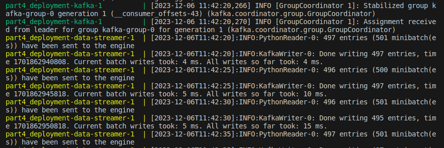
To see the dashboard go to localhost:8080 in your web browser.
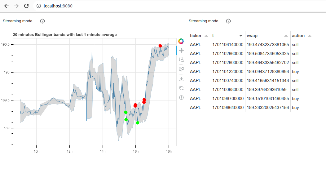
Now you have a web dashboard and events pushed to Slack!
Conclusions
Welcome to the Manul pack: starting with static data exploration, you have built and deployed a dashboarding data application updating in realtime using streaming data! You have integrated Kafka, a production grade streaming data broker, and have implemented an alerting functionality. You now know how to run a full Data Science project in Pathway, from idea to deployment.